
DZ's Market Analysis: A Fibonacci & Wyckoff-based analysis of SPY and VIX from 2020-2022, & what might come next.
The market has followed Fibonacci-length accumulation and distribution from late 2020-onward. Also covering: TLT.

Greetings Everyone,
I hope everyone had a nice Thanksgiving holiday and a good refresher before the Christmas season gets fully underway. I certainly took advantage of the R&R.
As on-brand as 2022 has been, this past week was textbook wild. Jerome Powell came out with an hour-long interview, leading to an incredible rally: SPY 0.00%↑ and SPX rallied from the $390s to its 200 day moving average at $403 and has since been flirting with the “2022 downtrend line” where all previous rallies have topped out. Funny thing is with Powell’s speech Wednesday — this was very much staged, as the market began rocketing higher before he spoke a word.
If you have an hour to spare, his full interview can be listened to here (and you should, so you can come to your own conclusions about the tone of the upcoming Fed policy decisions):
Friday’s non-farm payrolls was also eye-opening: the 262k print was WAY above Wall Street’s expectations (and foreshadowed by Powell’s speech on Wednesday). “Good news was bad news” for about an hour from the NFP data drop to the open, then it was a slow-grind up all-day Friday.
That’s a quick recap of the most significant events last week. Let’s talk charts.
1. SPY (SPX) Daily Chart Since 2022
Here is SPY’s daily chart going back to the 2020 U.S. elections:

This is a busy chart. Let’s distill the main point’s I’m trying to make with it.
Every major “zone” in the above chart followed an *exact* number of days in either an accumulation or distribution zone following a Fibonacci sequence (I defined each zone as the number of consecutive days where a daily bar fully closed within a red or blue zone and remained there until a close outside of the zone).
The 2021 bull run lasted exactly 255 days before retreating to accumulation briefly and then restarting a 55 day distribution from late 2021 to early 2022.
The drop-off from Feb-Mar. 2022 was a 34-day accumulation period in the “dark blue” zone. The selloff ended after the March FOMC meeting.
SPY went back into “dark red” distribution for 8 days before closing in-and-out of the red distribution/no-man’s land between accumulation/distribution into mid-late May.
A huge selloff on consecutive hot CPI reports and 75 bps Fed rate hikes led to a 55-day accumulation period in the SPY, with an early June rally notwithstanding as SPY was still in accumulation.
After the July FOMC, the first major “Fed pivot” rally started, and aided by a cooler-than-expected CPI. Some sideways accumulation took place until late July where the SPY rallied to $432 into mid-August. SPY was in both the light and dark red distribution zones for exactly 21 days, with the SPY closing outside of distribution after Jerome Powell’s “Jackson Hole” speech that triggered the next selloff.
SPY would then enter accumulation again after the September 21 FOMC 75 bps rate hike, remaining there for 34 days. The SPY would bottom on October 13 after the October CPI report, where a HUGE put-option unwind sparked one of the biggest intraday reversals on the SPY in 2022.
Finally… the November CPI report and the aforementioned Jerome Powell speech at the Brookings Institute were the last two catalysts to get the SPY back to the 200 DMA & “2022 downtrend line”.
Despite the current rally having reached SPY’s 200 DMA and the downtrend line, the red distribution zones have remained flat with the accumulation zones curling down. The curling of these zones indicates where the next rounds of accumulation or distribution will take place. This is an indication that SPY will be moving out of distribution soon and back to accumulation.
As of Wednesday this past week, the SPY was 13 days into its current distribution. Thursday’s close inside the distribution zone is an indication that SPY is *likely* to trade inside this zone for another 6 days (giving an even 21 days inside distribution).
The FOMC meeting Wednesday-Thursday next week (as well as the December CPI) align with SPY exiting distribution the day before the December FOMC meeting. SPY would exit distribution below $386.
SPY can trade between $386 and $413 and still be in distribution, per the algorithm.
2. What about the VIX?
Here is the matching VIX daily chart for the above SPY chart:
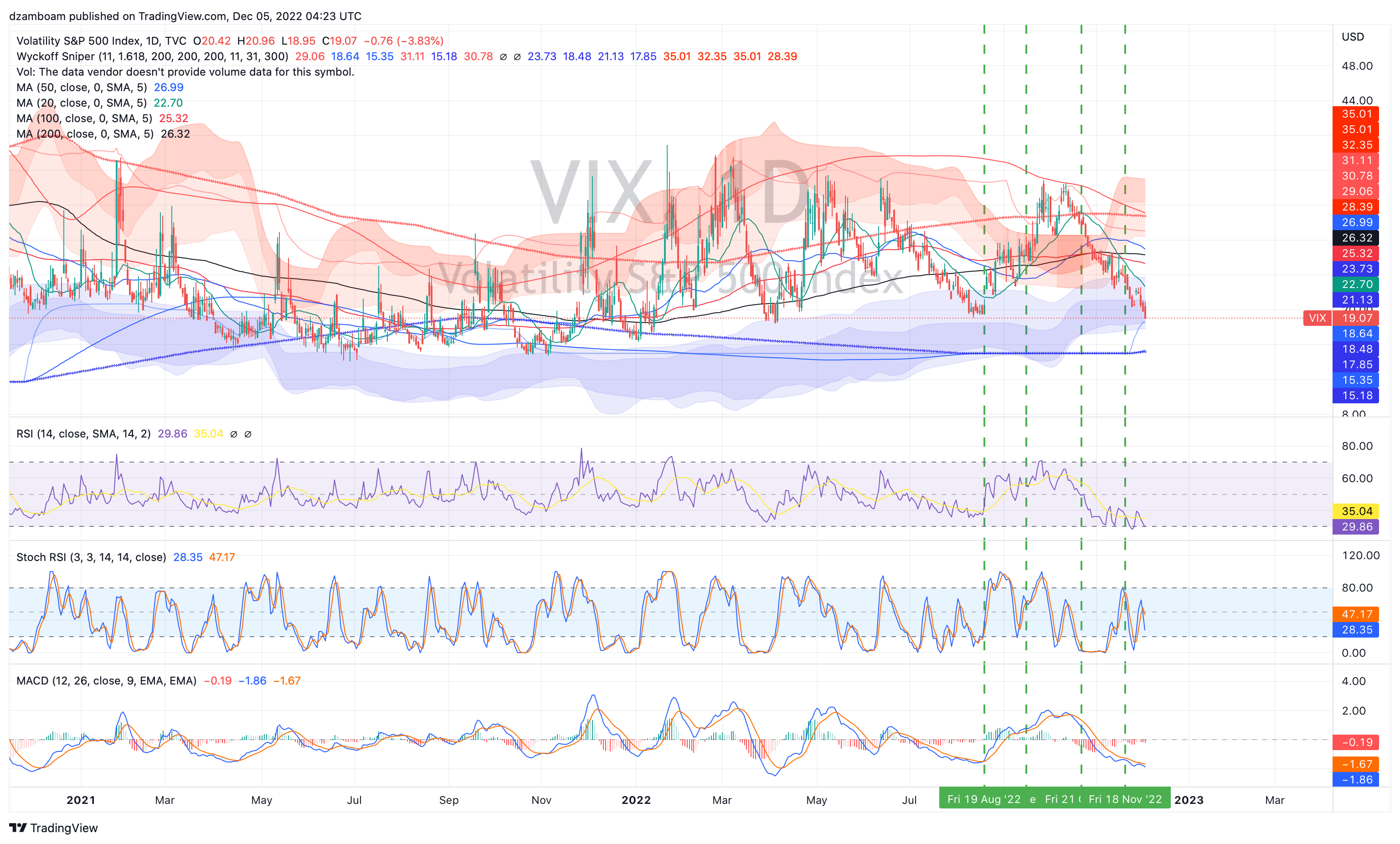
What’s interesting about the VIX, unlike the SPY:
The red distribution bands have been curling *up* despite having gone down nearly every day since mid-October.
VIX reflects SPX options pricing for puts and calls 30 days out. The fact VIX is this low implies that a massive hedge selloff has taken place.
Positive RSI divergence has emerged in the last 2 weeks, achieving a lower low with rising RSI (implying increasing demand/accumulation of SPX options).
The VIX is clearly buried here, and if you think the market has further downside from here, VIX < 20 has been a GREAT time to add put options or volatility hedges (i.e., UVIX 0.00%↑ and UVXY 0.00%↑ for short-term trading).
3. Parting Thoughts
Given the setup in both the SPY and VIX, it seems likely that this year’s “Santa Rally” has already come and gone. Furthermore, the recent movement in TLT 0.00%↑ has indicated a possible "flight to safety" move, as treasury bonds continued to get bid even after the "hot" NFP print this past Friday.
In the past, a bid in bonds usually meant a selloff in stocks (and vice-versa) as bonds = risk-off and stocks = risk-on. The recent bid in TLT and stealth-accumulation in VIX (despite the drawdown) indicate (in my opinion) a move to risk-off assets is coming soon. If inflation does indeed collapse and the Fed doesn’t need to raise rates to 5%+ to curb inflation, 10/20/30 year treasury bonds yielding 3-3.5%+ will accrue incredible gains if a recession comes in 2023.

One thing that’s different about TLT’s chart: the daily distribution bands are inside the accumulation bands. This sort of behavior has happened in the past with major short-squeezes, such as GME (GameStop). The accumulation bands have turned down, however. This is what I’d call a “panic” setup, where TLT may continue to get bid from here (the top of the dark red distribution band is ~$122) before another move down. It would take stubbornly hot inflation to kick back in for TLT to move down again (and imply the Fed does indeed get higher for longer).
These are the scenarios I think are plausible in the short term. We will have our answer soon as to which scenario(s) play out.
It’s going to be a wild two weeks.
Thanks all for reading!
Quick Plug: If you find my work educational and helpful for learning how the markets function, or help show you a couple techniques that help you learn something in your own trading journey, please consider supporting my work through either a free or paid subscription. Paid subscriptions help me subsidize costs on TradingView, UnusualWhales (and similar platforms) that help me put charts together and analyze data… and helps me buy an extra cup of coffee. All support is greatly appreciated!
Disclaimer: I am not a financial adviser, and nothing in this post should be taken as financial advice. This post is for educational purposes only, and all opinions presented reflect those of the author. The author, Dr. Andrew Dzambo is a Ph.D. in Atmospheric and Oceanic Sciences who’s main profession is academic research in the areas of cloud remote sensing and cloud physics… but has a passion for understanding global markets, especially in the context of how weather and climate patterns can affect the global economy.