DZ's Macro Analysis: SPX, VIX, DXY and TNX
Where do things stand after the Fed meeting?
Greetings Everyone,
The November FOMC meeting came and went, with the Federal Reserve raising the Fed Funds rate another 75 bps. The stock market reacted positively initially… until Jerome Powell reiterated its “premature” to think about a rate hike pause. The long-term trends, however, seem intact after this latest Fed meeting. I will cover SPX, VIX, DXY and TNX below, taking a longer-term trend approach.
1. SPX
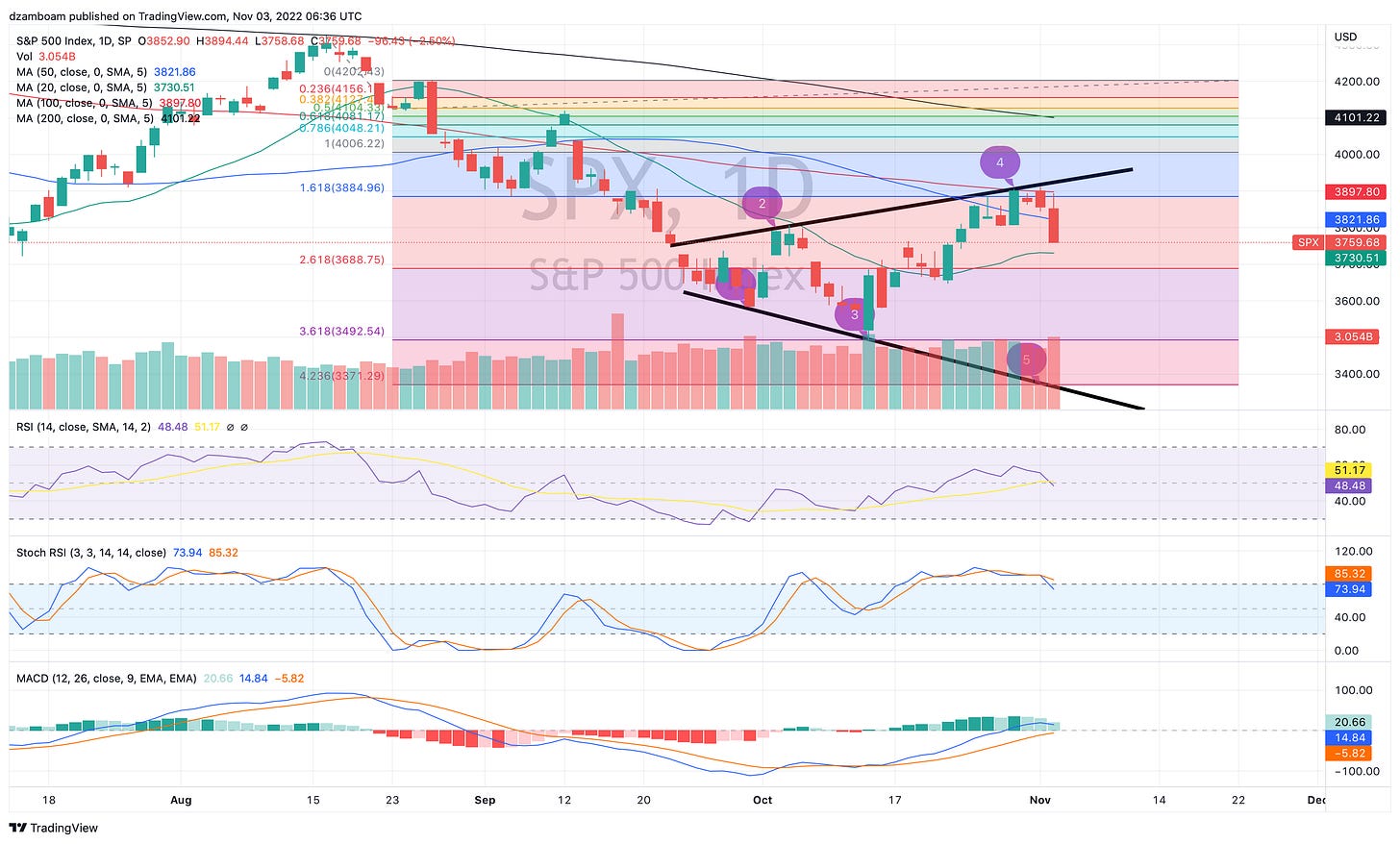
SPX “wicked” to it’s 100-day SMA after the rate hike announcement, then went into free fall mode for the rest of the day, closing at 2.5% down for the day. SPX closed within 30 points of it’s 20-day SMA, which over the last couple of weeks has served as an important support/resistance. I would not be surprised to see some sort of bounce from the 20-day SMA tomorrow (or in the very near future).
Another thing I’ve noted in the above SPX chart: On this daily time frame, an “expanding megaphone” pattern seems to be developing. If this pattern is to complete, a 5th touch-point could occur along the bottom black trend line. A possible intersect of the bottom trend line could occur around 3370 or so, which represents a full 423% Fibonacci extension move (using the peak of the August rally and the first retrace after the conclusion of the August rally as the reference points).
Time is running out, however, for such a move to happen that would validate the megaphone pattern above. Ultimately, the market will have to deal with the upcoming US midterm elections and the Fed’s interest rate projections in re-pricing the SPX (among other equities) here.
2. VIX (Volatility Index)
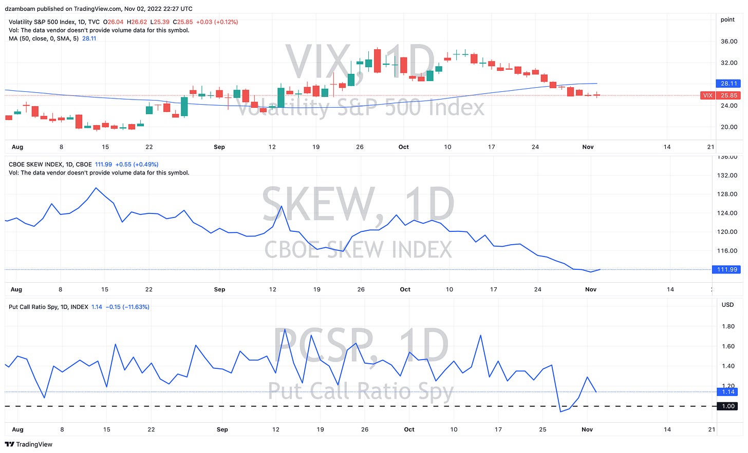
Despite the 2.5% drop in the SPX, the VIX barely budged today. Below is the daily VIX chart, with daily SKEW and Put/Call ratio shown as well.
There are many possible explanations for why VIX barely budged today… however, the decrease in P/C ratio indicates more puts being sold than calls (or more calls being bought than puts) while SKEW indicates limited out-the-money option buying. Demand for out-the-money options will need to increase to see VIX climb.
If this seems strange to you… you’re not alone. In my opinion, put buyers (i.e., bears) are probably quite tired of getting squeezed and margin called all year, not to mention VIX bulls are also getting tired of a lack of a “spike” happening.
3. DXY (US Dollar Index)
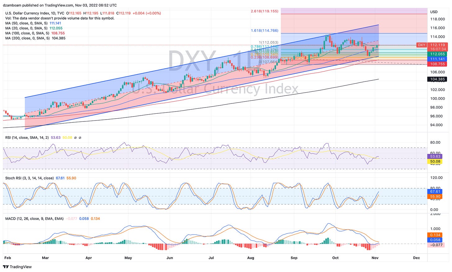
The DXY had a pretty wild day too. After the FOMC announcement, the DXY dumped to it’s 50-day SMA, and ultimately closed higher at it’s 20-day SMA. The 20-day SMA also intersects with a 100% extension of what (in my opinion) is the next major sequence for the DXY to follow upward.

The DXY has been on a massive bull run all year, and has respected the boundaries of the above channel. With DXY up on the day, it’s still in the lower boundary of the regression channel, meaning it has room “up” to get back to the average. This would put the DXY close to 113. The upper part of the channel intersected with the 161% in mid-September. If the DXY is to intersect the top of the regression channel as well as its next major Fibonacci extension (261%), this would take place sometime between mid-December and early January. Continued weakening of other currencies (e.g., the JPY, CNY, GBP) would need to continue for this to be possible.
Until this trend is broken, the chart strongly suggests the dollar will continue to strengthen for another several weeks or so.
4. TNX (10-year US Treasury Yield Index)
Finally, let’s discuss what the 10-year yield did today (and all year).
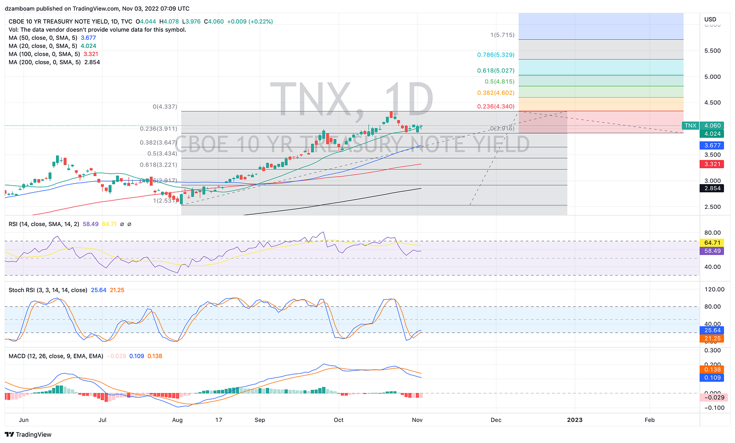
The 10-year yield has ramped higher all year with inflation running extremely hot and the Fed tightening considerably. How much higher it goes from here is anybody’s guess, given the arguments for both “sticky” inflation staying elevated for a long time as well as deflationary concerns that come with a recession/rapidly cooling economy.
From the TNX’s most recent trough in mid-August (coinciding with the peak of the August stock market rally) to the peak at 4.33% in mid-October, the TNX retraced only 23.6% of its move before curling higher — a strong bullish signal for the TNX. One caveat though: slight bearish divergence in RSI is noted between its initial run from 3.9% to 4.3%, so any upside breakout would need to confirm higher RSI at yields greater than 4.3% to confirm bullish upside continuation.
In my opinion… even with what the chart suggests, going higher than 4.33% seems unfathomable given the market-wide implications these high yields have. The long-term SPX dividend yields is 1.85% by comparison, so really, any 10Y yield above 4% for an elevated period of time may at some point entice investors to take advantage of the higher-yielding 10Y treasuries rather than equities.
Thanks all for reading!
Quick Plug: If you find my work educational and helpful for learning how the markets function, or help show you a couple techniques that help you learn something in your own trading journey, please consider supporting my work through either a free or paid subscription. Paid subscriptions help me subsidize costs on TradingView, UnusualWhales (and similar platforms) that help me put charts together and analyze data… and helps me buy an extra cup of coffee. All support is greatly appreciated!
Disclaimer: I am not a financial adviser, and nothing in this post should be taken as financial advice. This post is for educational purposes only, and all opinions presented reflect those of the author. The author, Dr. Andrew Dzambo is a Ph.D. in Atmospheric and Oceanic Sciences who’s main profession is academic research in the areas of cloud remote sensing and cloud physics… but has a passion for understanding global markets, especially in the context of how weather and climate patterns can affect the global economy.


